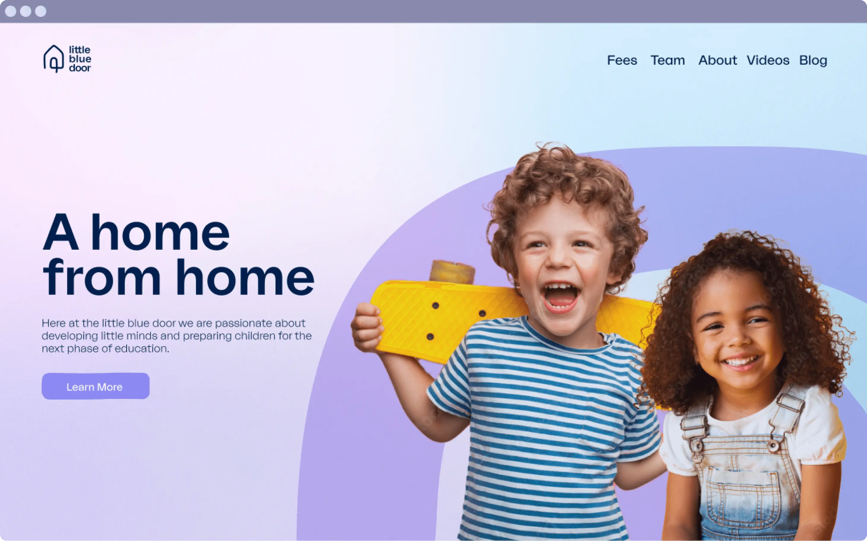
The Little Blue Door is popular children's nursery based in Chichester on the south coast of England, with two locations across the city.
We were commissioned to create a brand identity that not only reflects the nurturing environment inside of the walls of the nursery, but also captures the essence of childhood wonder. The challenge was to create a visual identity that resonates with parents while inviting the curiosity of the little ones entering the world of learning and play.
Coinciding with the launch of a second location, we had the exciting opportunity to help shape the look and feel as they entered into this next phase of growth.

LOGO
The Little Blue Door logo is an embodiment of the nursery’s ethos – it’s warm, welcoming, and beautifully simple. The door motif, with its playful nod to a child's creative drawing, is an open invitation to a world where imagination thrives, appealing to both the little ones and their parents.
We've chosen a lowercase typeface to capture that innocent, childlike essence, with soft curves that suggest a friendly and reassuring space. It's a reflection of the nursery’s dedication to creating an environment that’s not just safe, but also nurturing and full of possibility.

COLOURS
You won’t be surprised that our colour exploration started with blue. When a colour features in the name of a brand you’d have to be a bit of a maverick to go in a different direction.
The first challenge was that blue is not often the colour associated with warm, inviting and nurturing. So with that in mind, we added a series of warm pinks, purples and neutrals that together hit the right notes for what we wanted.
The second challenge was creating a palette that worked both internally, resonating with the children, but also one that worked externally, appealing to parents and also professional bodies.

GRADIENTS
To add further to the colour-use across the brand, we introduced subtle gradients that nod to the transitions of the sky, creating a sense of blue-sky thinking, vision and wonder across both digital and print media.


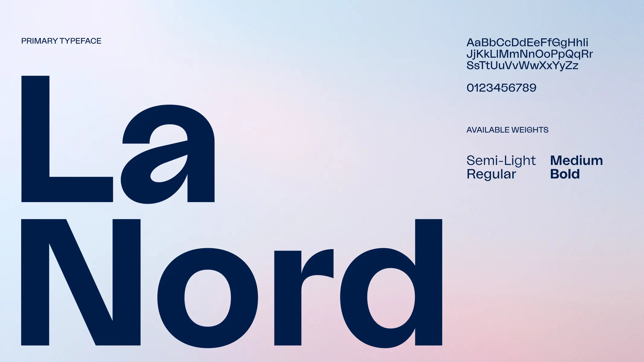
TYPEFACE
We opted for the beautiful La Nord from Raoul Gottschling feeling that it perfectly balanced the childlike whimsical element whilst still feeling professional, legible and timeless. Comic sans was a close second.
In lighter weights, such as semi-light and regular, La-Nord creates a serene, peaceful and high-end feel. But at heavier weights, such as Medium and Bold, it carries more punch and impact when a message needs to be communicated more strongly.

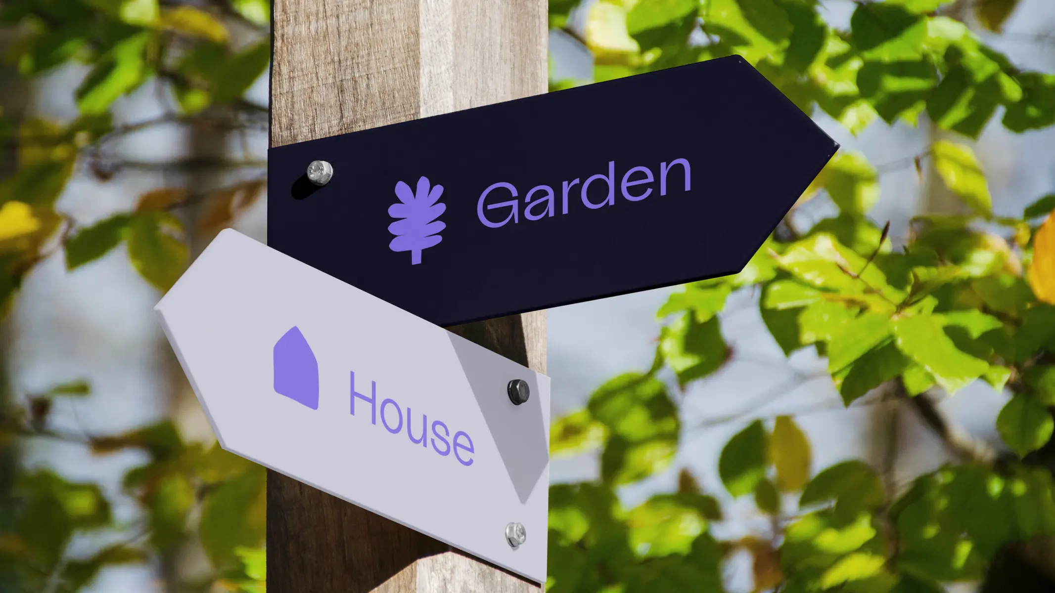
PLAYFUL ICONS
To further amplify the brand's playful note, we designed a set of icons that can be used both in digital and print collateral. The icons represent the core values of the Little Blue Door. Our style inspiration came from ‘sponge’ art, a favourite among children.


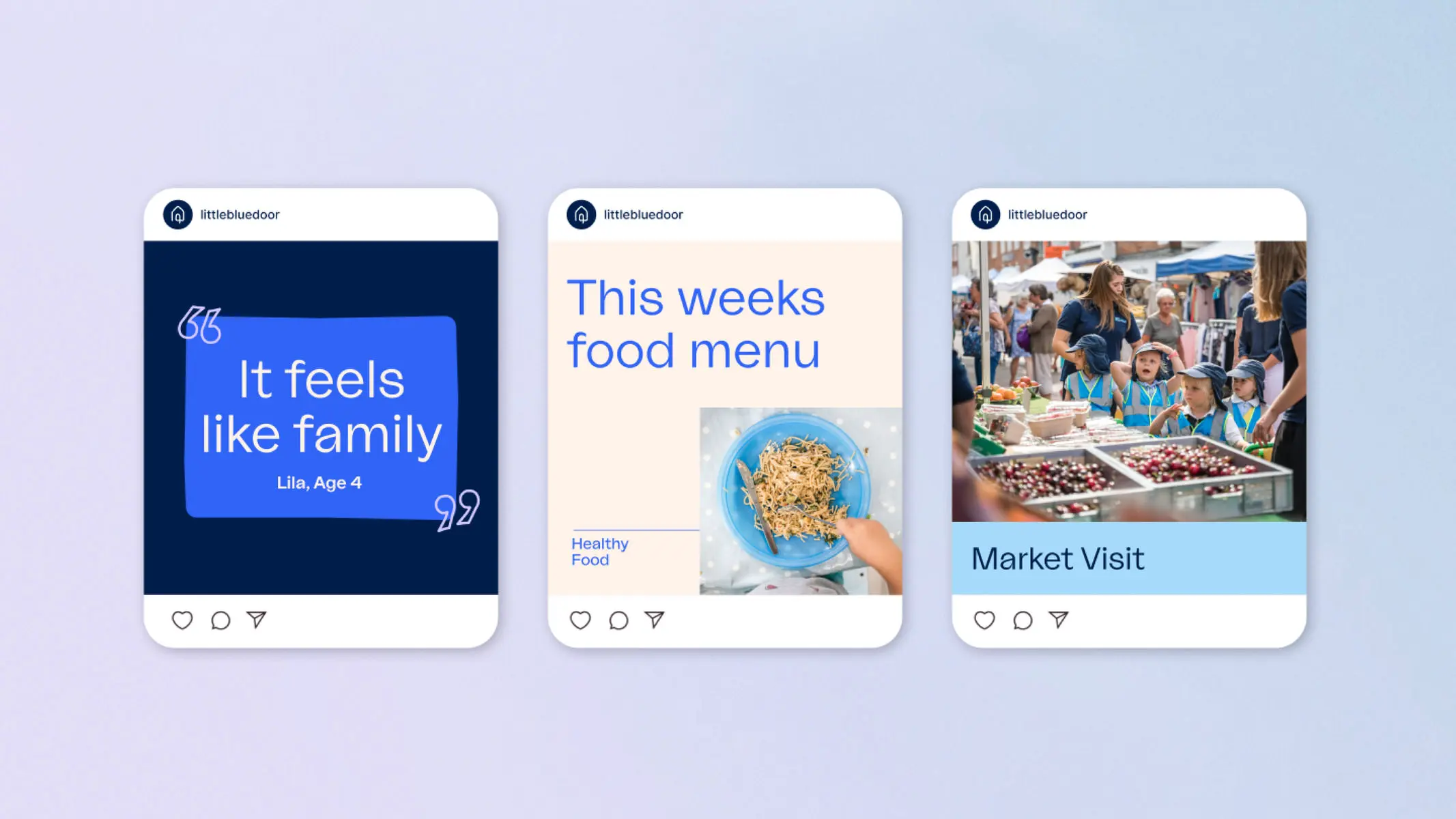
Bringing all of that together, we created a range of brand collateral, including social media templates, posters, signage and more.